

FIQUEON // Visual Identity // BR - 2022
[PT]
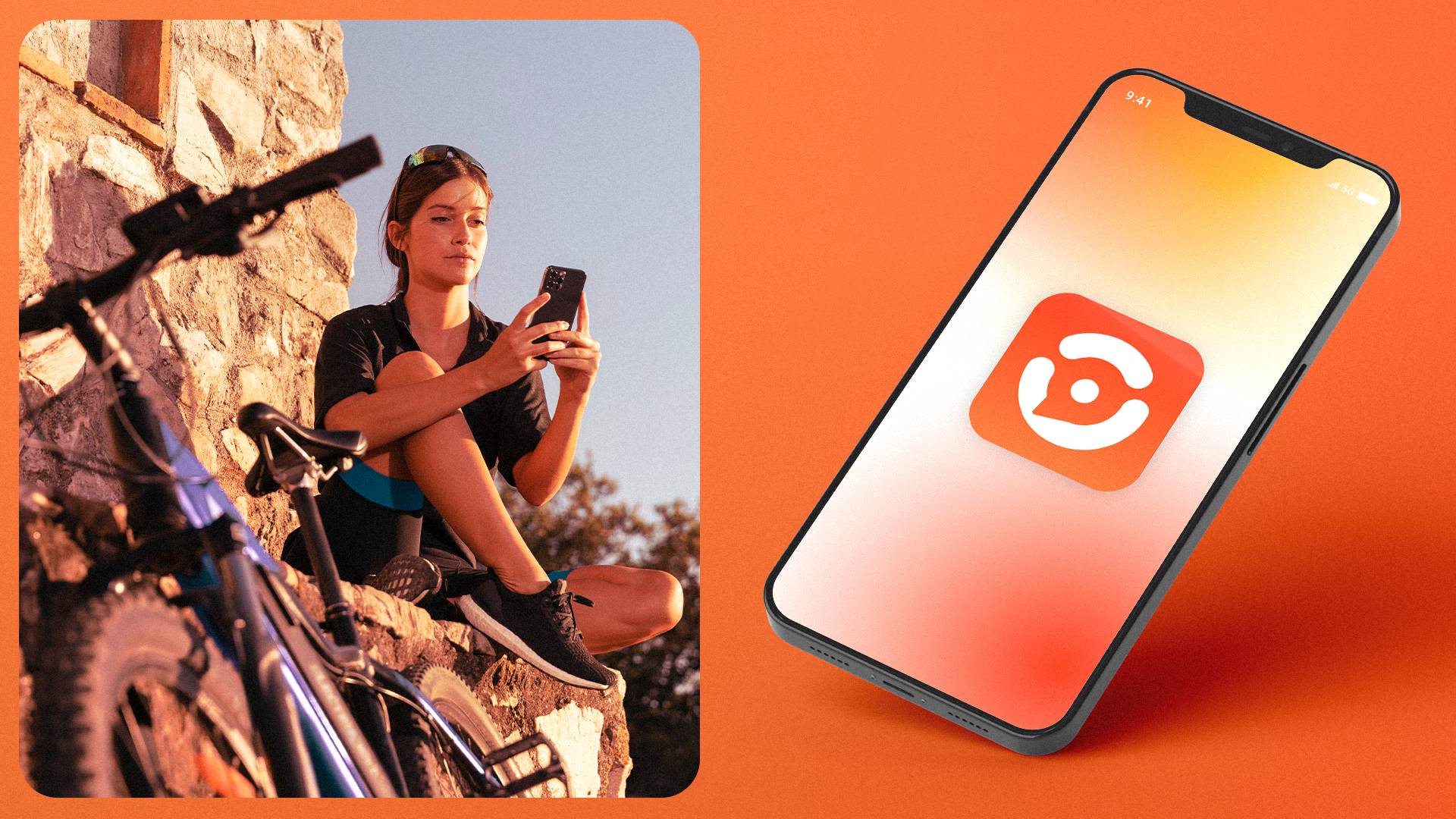
Uma conexão entre as ruas e o digital. Uma comunidade. Um app. Uma marca. Fiqueon!
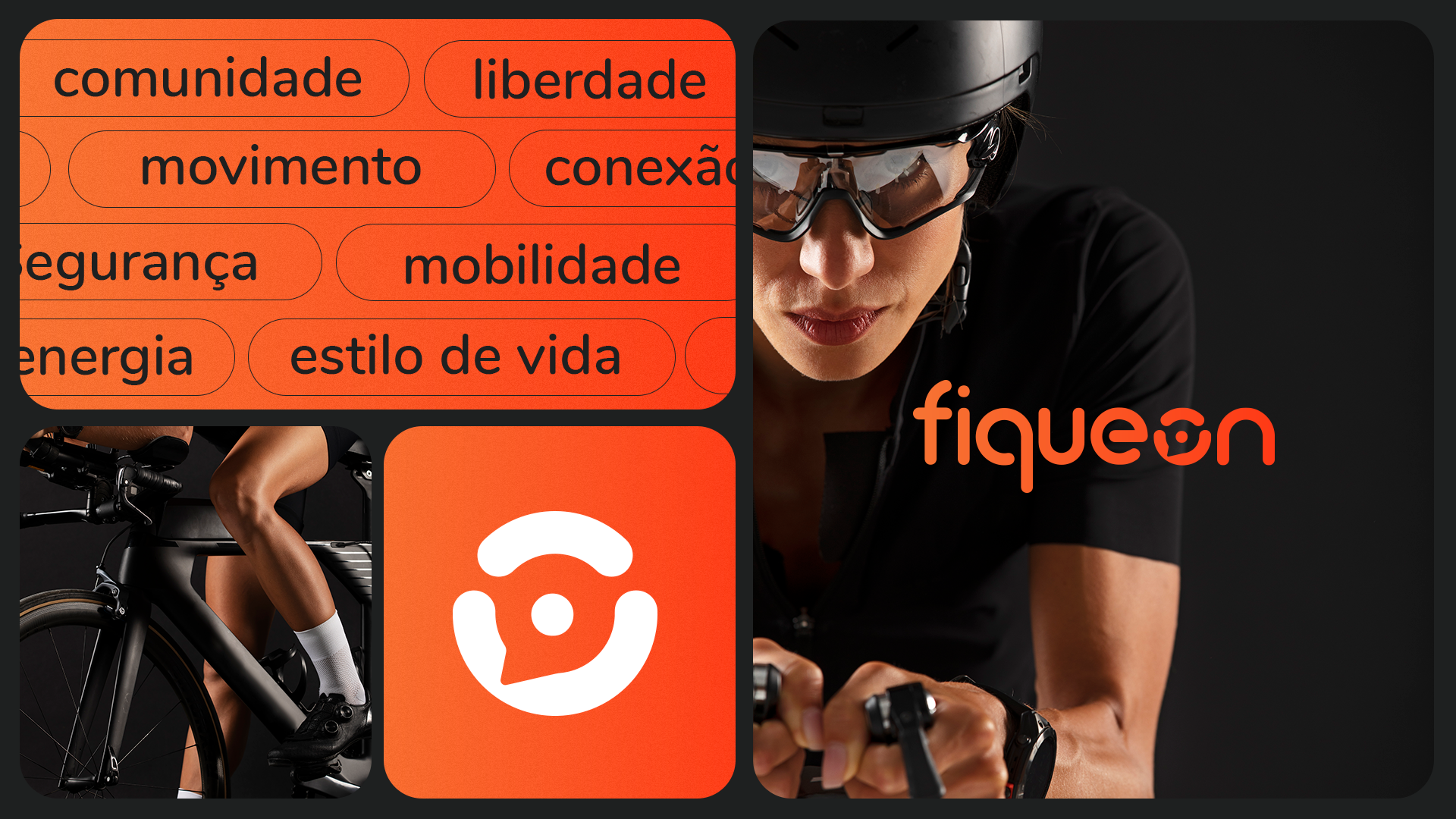
A Fiqueon nasceu com o propósito de unir ciclistas e motociclistas em uma só comunidade, conectando o que acontece nas ruas com o mundo digital.
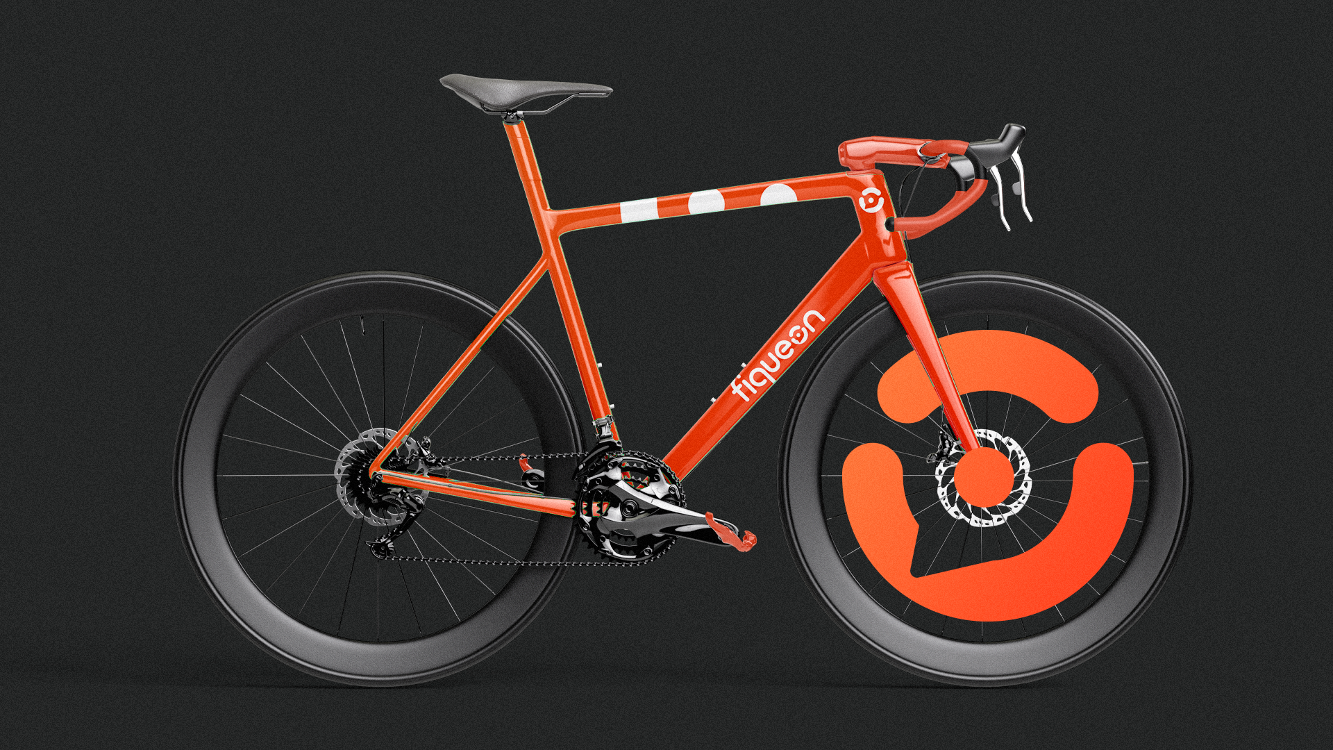
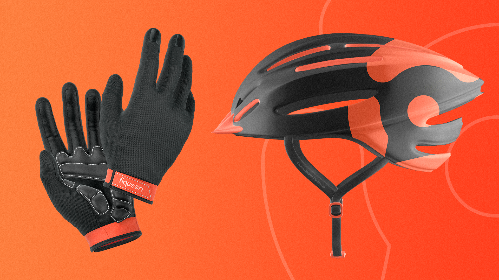
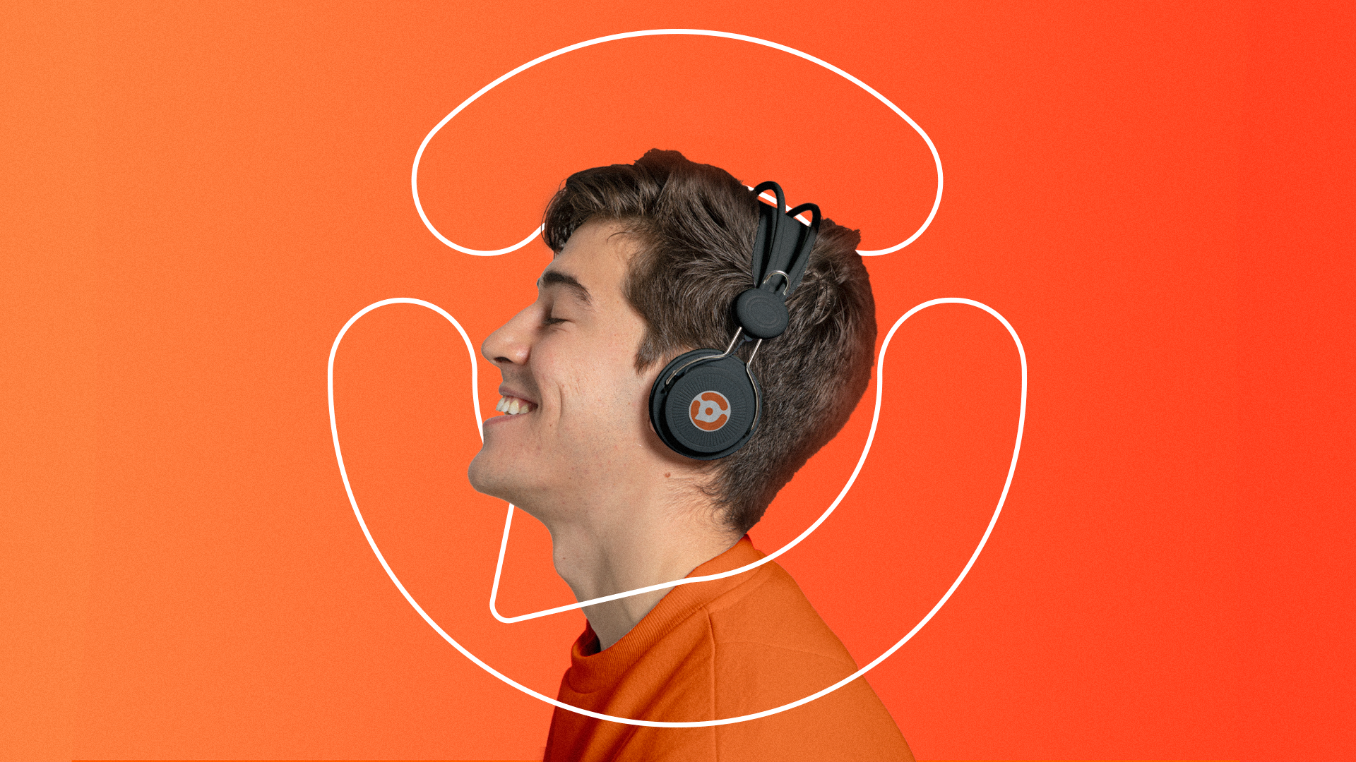
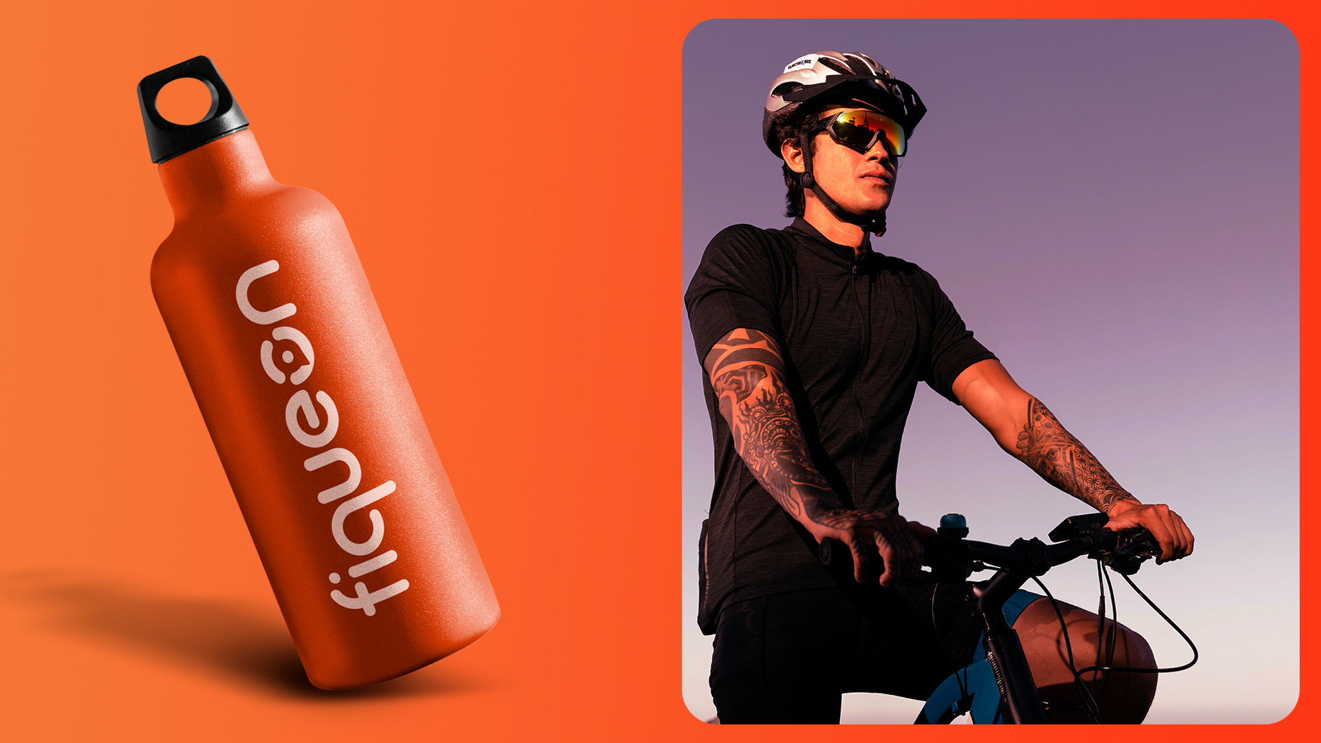
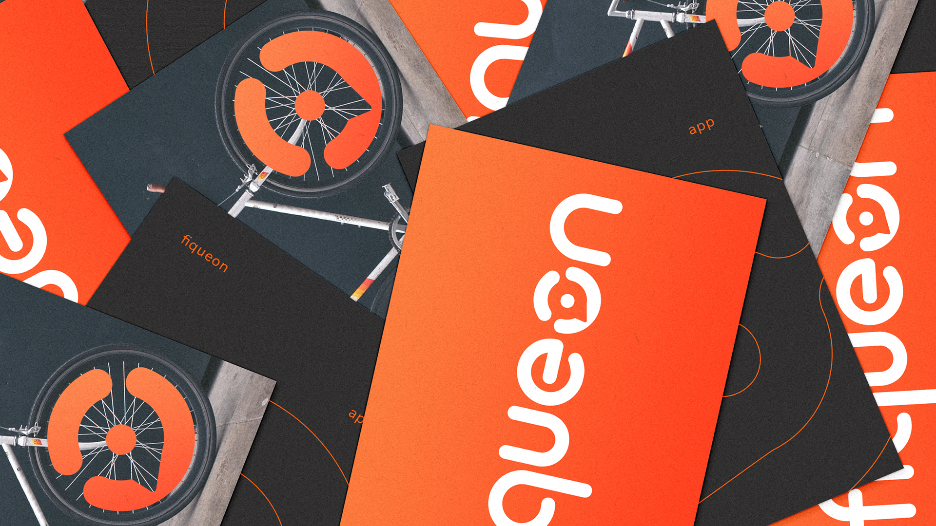
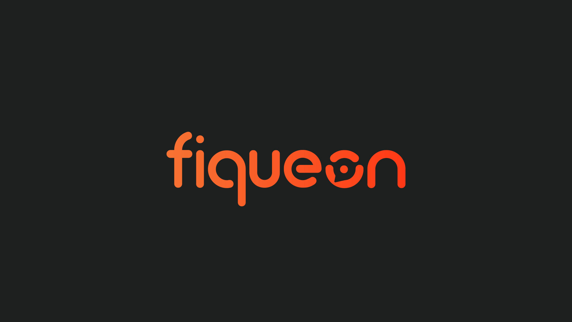
Mais do que um app, é uma experiência que carrega identidade e propósito. A marca foi construída com base na ideia de integração entre o online e o offline, com uma estética limpa, energética e moderna. O destaque vai para o "O" do nome, que virou ícone: inspirado na roda, na conversa e no digital, trazendo um símbolo único e cheio de significado.
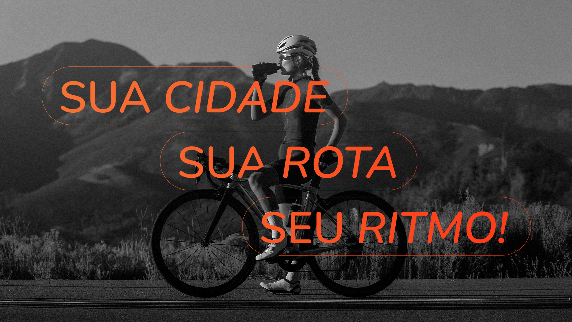
Além disso, são os detalhes que tornam uma marca verdadeiramente memorável e as cores são um desses pilares essenciais. A escolha do laranja na Fiqueon não foi por acaso: vibrante, ativa, alegre e estimulante, ela traduz perfeitamente a energia que queremos levar das ruas para as telas. E para reforçar ainda mais o DNA digital da marca, criamos um degradê que transmite movimento, inovação e presença. Uma combinação que faz a identidade pulsar com autenticidade!
[EN]
A connection between the streets and the digital world. A community. An app. A brand. Fiqueon!
Fiqueon was created with the purpose of uniting cyclists and motorcyclists in a single community, connecting what happens on the streets with the digital world.
More than an app, it is an experience that carries identity and purpose. The brand was built based on the idea of integration between online and offline, with a clean, energetic and modern aesthetic. The highlight is the "O" in the name, which has become an icon: inspired by the wheel, the conversation and the digital world, bringing a unique symbol full of meaning.
Furthermore, it is the details that make a brand truly memorable and colors are one of these essential pillars. The choice of orange for Fiqueon was not by chance: vibrant, active, cheerful and stimulating, it perfectly translates the energy we want to bring from the streets to the screens. And to further reinforce the brand's digital DNA, we created a gradient that conveys movement, innovation and presence. A combination that makes the identity pulse with authenticity!

Thank you for getting here!
Follow us on Instagram → @obrand.agency and @mayaragons
Site → www.obrandagency.com
Email → contato@obrandagency.com