

LESS COLLECTION // Visual Identity // BR - 2022
[PT]
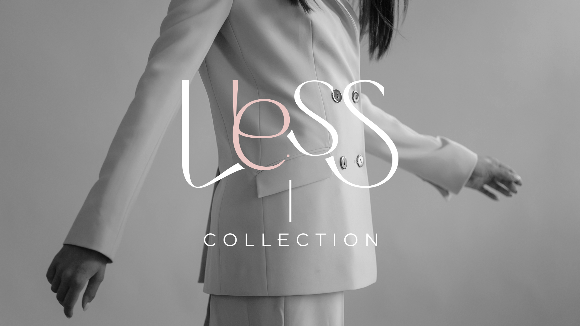
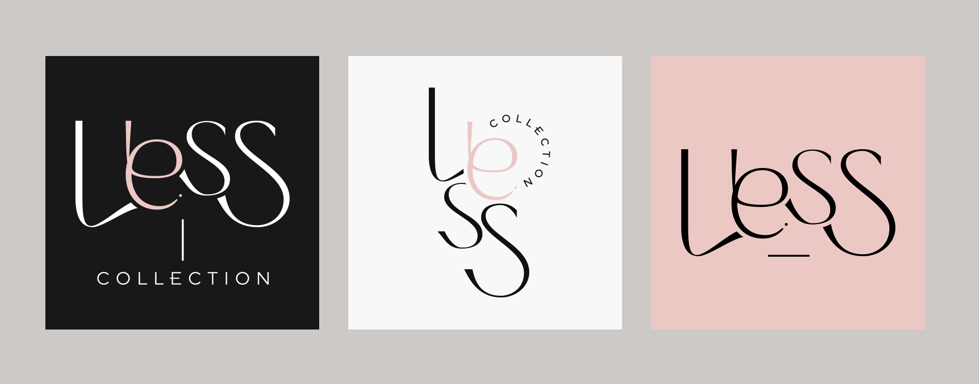
Minimalista, elegante e moderna: essa é a essência da Less.
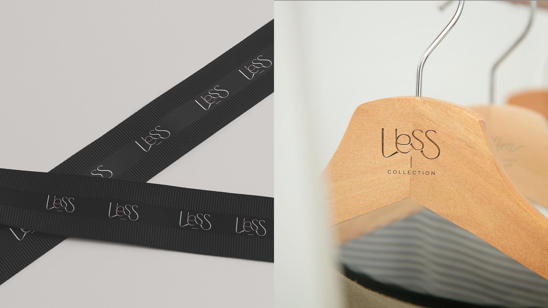
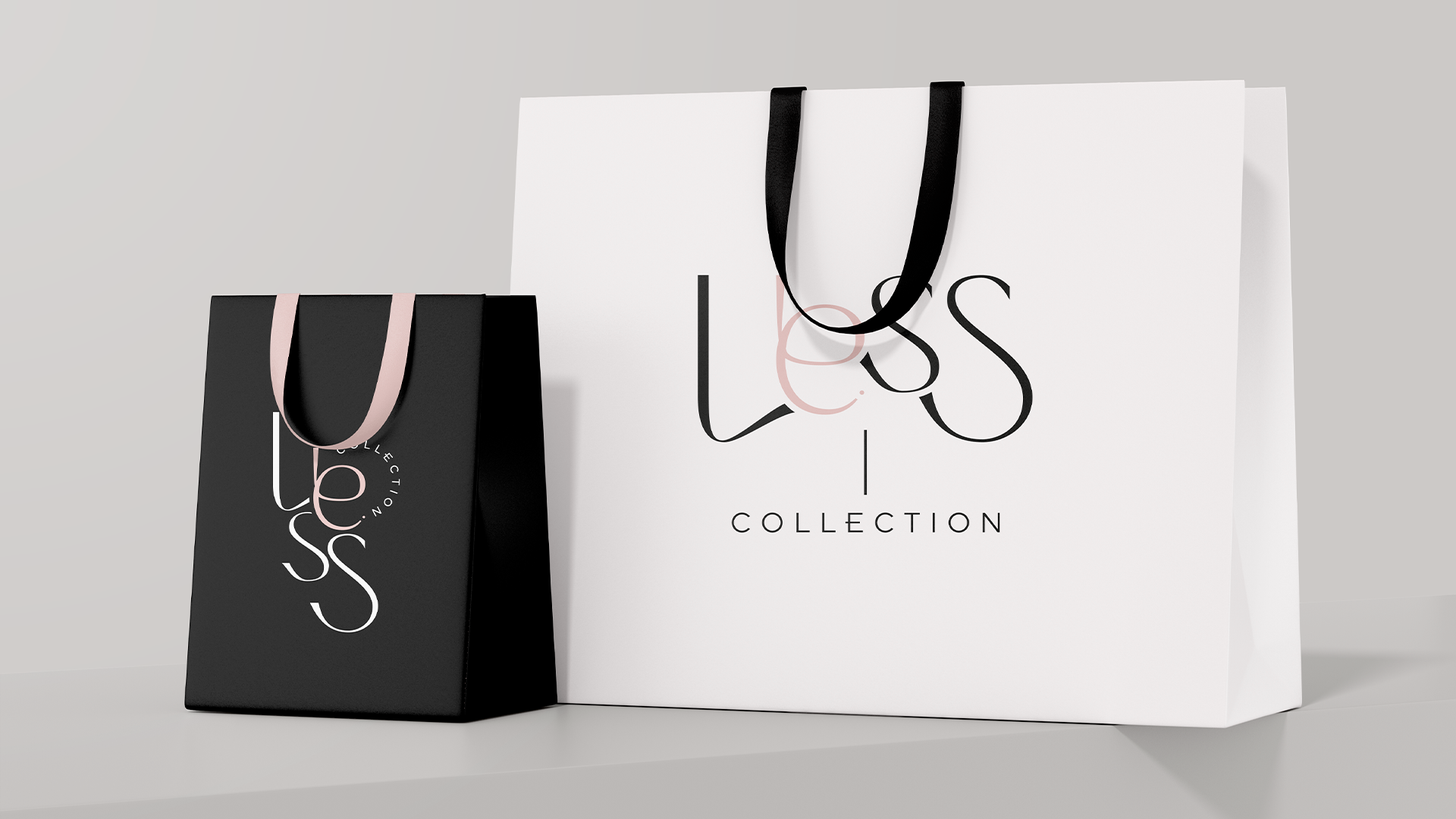
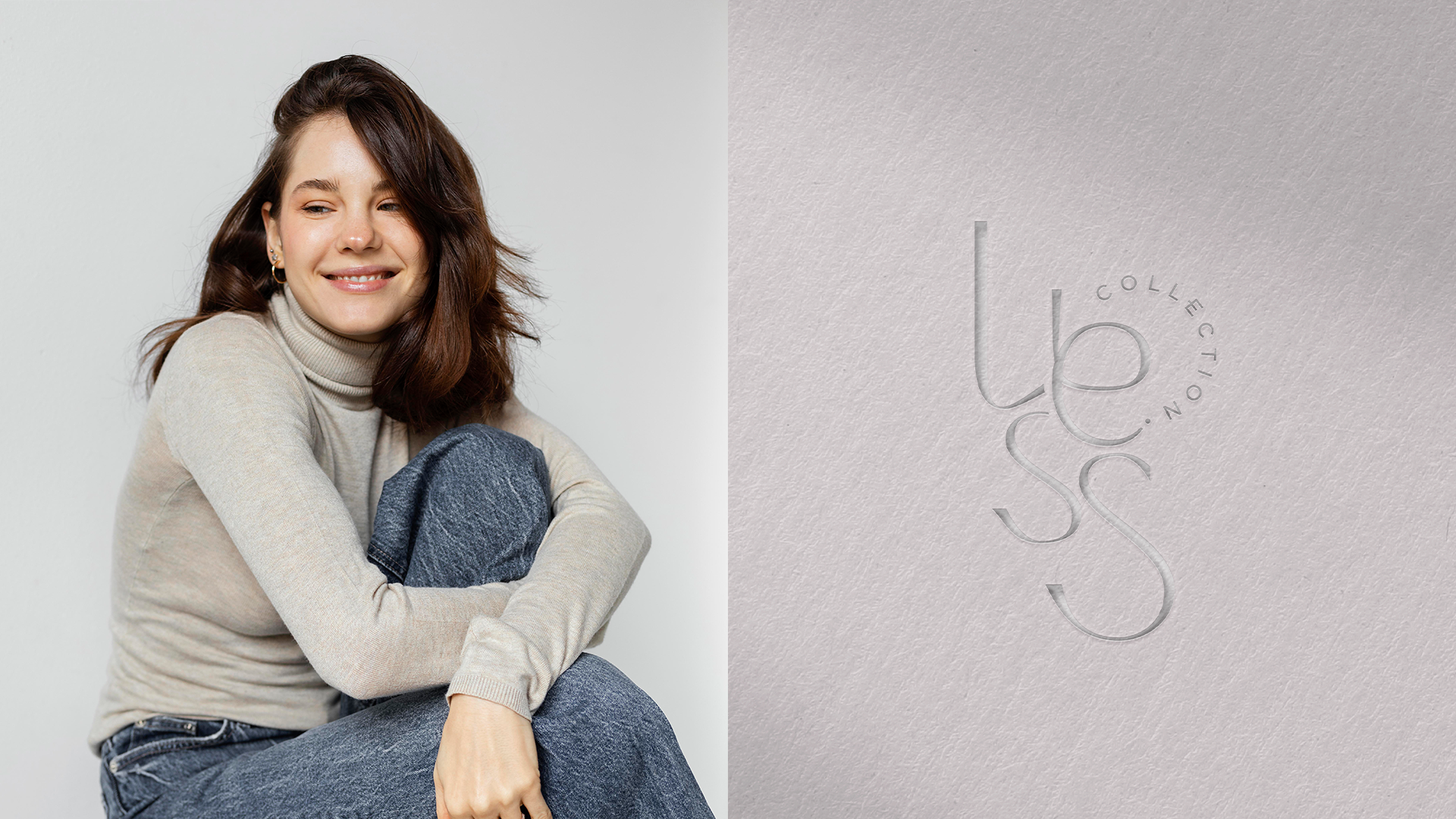
Para traduzir a proposta da marca em sua identidade visual, buscamos destacar o poder do básico com um toque de personalidade. O ponto e a cor na letra "E", a menor e teoricamente menos notada no logotipo, representa exatamente isso: o detalhe que faz toda a diferença. Uma escolha sutil, mas cheia de intenção, que reforça o conceito de que "menos é mais".
Esse detalhe visual reforça que o essencial pode – e deve – ter presença. Porque estilo não precisa de excessos, e elegância se encontra nos mínimos detalhes.
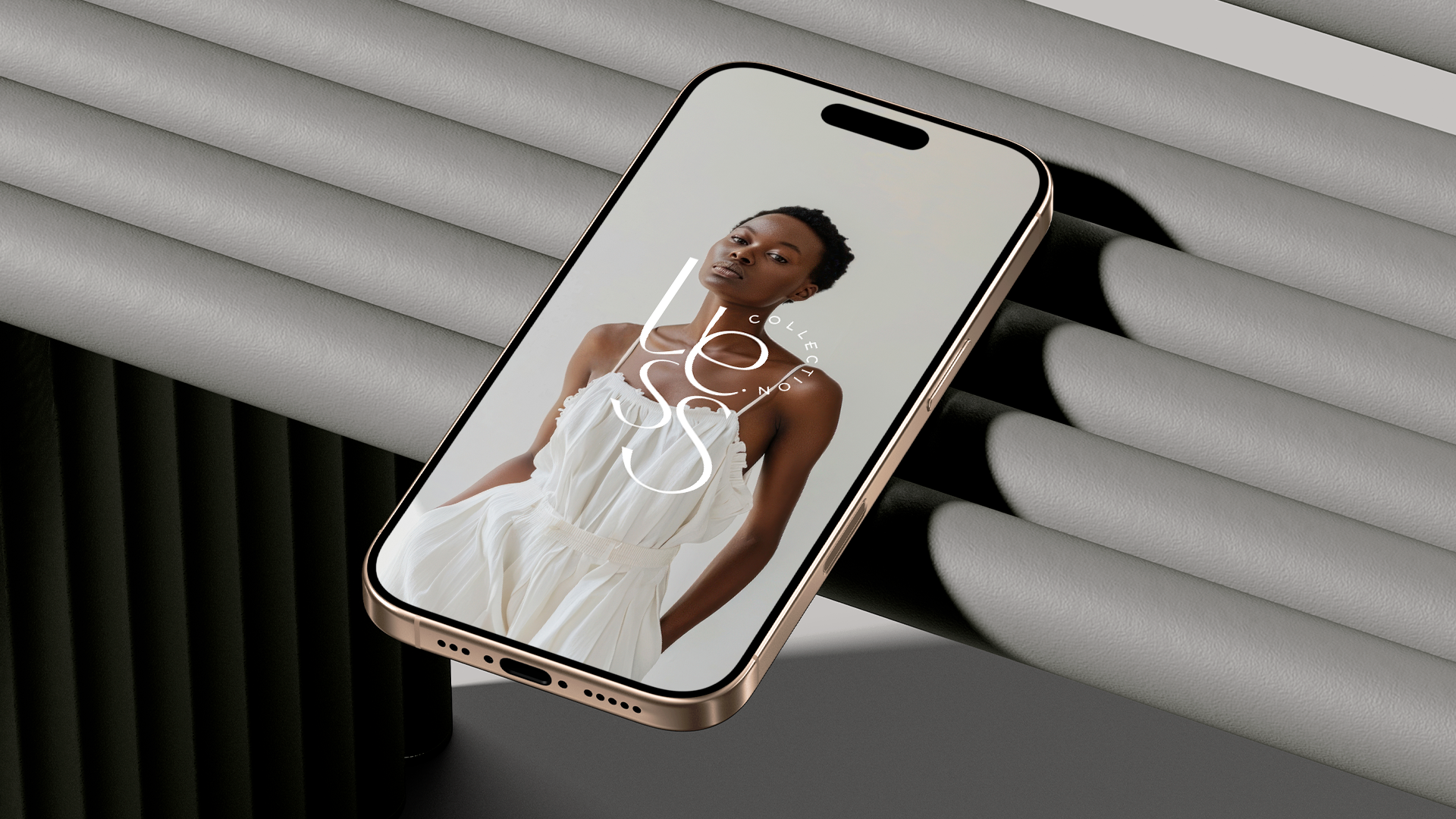
Como complemento, desenvolvemos uma fonte minimalista, mas com curvas e movimentos que transmitem leveza, sofisticação e autenticidade. Cada traço foi pensado para valorizar o espaço, o silêncio visual e a estética clean que traduz a alma da Less.
[EN]
Minimalist, elegant and modern: this is the essence of Less.
To translate the brand's proposal into its visual identity, we sought to highlight the power of the basics with a touch of personality. The dot and color in the letter "E", the smallest and theoretically least noticeable in the logo, represents exactly that: the detail that makes all the difference. A subtle but intentional choice that reinforces the concept that "less is more".
This visual detail reinforces that the essential can – and should – have presence. Because style does not need excesses, and elegance is found in the smallest details.
As a complement, we developed a minimalist font, but with curves and movements that convey lightness, sophistication and disadvantages. Each stroke was designed to enhance the space, the visual silence and the clean aesthetic that translates the soul of Less.


Thank you for getting here!
Follow us on Instagram → @obrand.agency and @mayaragons
Site → www.obrandagency.com
Email → contato@obrandagency.com